Monday, June 8, 2015

Bloggers Helping Bloggers #2

So I was a little nervous posting Bloggers Helping Bloggers last week for the first time -- it's a bit of a new idea and wasn't sure how it would be received.

But everyone seemed so positive! We received 26 link ups and ten reviews, not to mention 450 views, 25 comments and +27 on Google+

That I am glad to continue the idea for bloggers to come together and review each other sites! This would be free - it just might take 10 or 15 minutes of your time but, you will have your site reviewed in return.

I have seen a few websites offering reviews but the costs ranged from $50 to astronomical prices, so I thought we could all help each other out.


I was trying to think of the best way to organize it, and am still thinking it over -- please leave a comment or e-mail me if you have any suggestions.

I was trying to think of a fair way to choose which site gets reviewed each week and decided to choose the blog based on a points system:

1. You will be given 5 points for linking up each week.

2. You will be rewarded 15 points for reviewing the blog of the week. (People who don't put in any effort will receive less points)

3. And a bonus 3 points for sharing on each different social media platforms every week. Please tag me so I can reward the points. Tag me @101thingstodo1, and +1 or share and comment on G+, share and comment on facebook or leave a comment on Pinterest. A tie will be given to the first one in the link up.

So for example if someone links up, reviews the weeks blog and shares on Google+ and Pinterest they will receive - 5 + 15 + 3 + 3 =26 points for the week which will be added to last weeks points.

Let me know if you have any questions???

And if everyone wanted I can post the current points (excluding the e-mail addresses) so you know when your blog will be reviewed. please leave a comment

One site will be chosen each week, and the review will be posted on my site Monday's beginning at 7:30 am EST. Because the review is so long I will be switching the link-up to Tuesdays at 7:30 am and the review will be posted Mondays at 7:30 am. starting next week. (Sorry for any confusion)

You can read last week`s Blog Review: Musings of an Average Mom here. You might gain some helpful tips that you can apply to your own blog.  

http://musingsofanaveragemom.blogspot.ca/2015/06/musings-of-average-mom-blog-review.html


Please review sites on:

- header
- sidebar (appearance and arrangement)
- how easy it is to follow on social media
- content
- how easy it is to read (fonts, etc.)
- how easy it is to navigate, and find what you are looking for.
- overall appearance
- other comments or suggestions
 
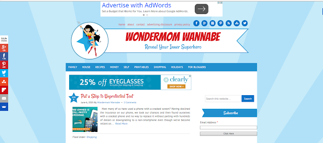
And the winner this week is... Wondermom Wannabe with 26 points for promoting on Google+ and Twitter!


http://wondermomwannabe.com/


Please e-mail your review to kristenstevens@live.ca and I will review and organize/summarize them and post them next week. Along with the next blog to review. 

And although it's not necessary I would love it if you followed me (I always follow back):

You can follow me on Pinterest, Google+, Facebook or Twitter 

And I would really appreciate it, if you could share this party on your sidebar or link party page. It will be better to get more reviews and opinions on your blogs.

Musings of an Average Mom

Please bare with me as  I will try to iron out any kinks as we go along...

Please link up your main blog - and make sure you're email is correct as I will use this to contact the winner. And I will try to get to everyone in a fair and timely manner.

And please don't forget to review the blog of the week (this week is Wondermom Wannabe) And bonus points are rewarded for promoting on social media. tag me on twitter @101thingstodo1,


Disclaimer: Musings of an Average Mom will use screenshots of your blog if you are chosen as the blog to be reviewed. And your comments will be copied and posted anonymously in the blog review.

Musings of an Average Mom Blog Review


The first week of Bloggers Helping Bloggers Link Party was such a success! I am blown away by all the valuable and insightful information I received. And because the review is a little lengthy I decided to split the review and the link party. The review will be posted Mondays at 7:30 am EST and the Bloggers helping Bloggers Link Party will begin at Tuesdays at 7:30 am EST (beginning next week)


So last week, I received nine reviews on my blog and the suggestions were so great I had to hold off on implementing them until after I published this post!

Overall Appearance:


My first impression is: this must be a Blogger blog. It looks nice and friendly but a little bit amateurish. I love the labels in the sidebar like Popular Posts. I like that fact that I can immediately see the woman behind the blog in the sidebar.


The overall appearance is great. I love the white background which is clean and easy read. 

When I click onto your site, and I am looking above the fold, I have a couple of recommendations I think would help you with new visitors. First, I don't see a picture of you, which means I am not engaged with you unless I scroll down and see your picture. In fact, I have to pass by three ads (one in the header and two in the right sidebar) before I see you. This means I don't immediately register you as the author. I automatically sort of see you as another ad. You also need an "About Me" tab for convenience. I want to know you! As I scroll down, I see there is a lot going on.  


Header


The header looks a bit wonky, because it's not centered. Also it looks like one of the headers you can get for free if you google 'headers'. Having said that: I do like the way it looks. I also like the menu beneath the header. Though there aren't all that many items in the menu.

I love the design. Would prefer it to span the entire page rather than ending at where the sidebar begins below since it leaves a blank space in the upper right corner.

I like the look of the header, but I would love if it was centered. Also, I think it could be a little bigger. It's not like your blog name gets lost, but it doesn't really jump out, either.

This is actually the very best part of your blog, in my opinion. May I also add that my daughter, who did not know what I was doing, but is a social media expert in her own right (aren't all 12 year olds?), said, "Ooooo!! I love her Cover Photo (I was following you on Google+ at the time). It did look very attractive. You might take a note of the set up of your Google+ page. Your picture is in a circle right at the top next to your logo. Underneath, and separate are your posts. Very orderly. Very attractive. The one thing I want to beg you to do it to remove the bluehost ad from under your header. I know why it's there, but it's not the best first impression.


Sidebar (appearance and arrangement)


I like how you have your sidebar broken down by titles. I just wish your titles where all the same color.

I realize people have advertising however I would prefer to see your About Me at the top of the sidebar and perhaps even an About Me page. 

Nice size, as are the widgets within it. Would love to see the search bar near the top of the page though so it is easier to find. I really like that you have a popular posts section and the layout of it is very attractive.

I love your social media buttons! I think your About Me should be higher on the page (above the fold) and I heard recently that the search button should, ideally, be above the fold, too.

 I think this needs to be slimmed down. The ads should go below information about you. The thing is, I know you want to sell ad
space, and above the fold is a prime location, but you will in my
opinion, get more followers if you look like you are there to share your life and help people rather than be a billboard. It seems a little false to put them under the hearts, but over your picture. Your pic should be under those hearts, girl! It's you we should love, not a website builder. You should then bring all of your tabs under your picture, starting with the search bar. People won't search for the search bar. They will leave. Links, Ads, Invitations to Advertise, and Buttons should be underneath the important information about your blog and what you are about. 


I like your popular posts in the sidebar, this gives me a picture of your content.


How Easy it is to Follow on Social Media


Love the icons for your social media and because of the colour they stand out well against the white background. It is very clear how to communicate with you.

Social media in the sidebar makes it easy to follow. Pinterest widget is nice to see the flavor of what people pin.


I see no about or contact page (I do see the email icon). What if I wanted to work with you, or ask you if I could share one of your posts, and wanted to know more?


Content


It's not clear to me what your blog is about. Looking at the menu I would say: about blogging. But that doesn't seem to go with your blog title which suggests more of a mommy blog. I especially like the 'Free Blog Elements' in the menu.

Well-written. Confusing to a first-time visitor though since the most recent content appears to be targeted towards bloggers while the title of the blog led me to believe it would be a parenting/lifestyle blog. As a blogger, I do love the content, I just wouldn’t have known to look for it here based on the blog name.


I really like your variety of content. As someone who couldn't possibly pigeonhole my blog into one niche, I love that you're covering such a variety of topics (and as a blogger, I LOVE all your blogging resources).

I clicked your post down that was recommended near the bottom called "Not Your Typical Potty Training Advice." I chose it over the other articles because of the adorable little boy in the picture. So cute! I would not have enjoyed that article because there was not much commentary, only bullet points. I like to feel like I am listening to a story. Then I checked out "Easter Minute to Win It" from the popular posts section, also because I felt it was the best picture (with actual photographs) and I wasn't interested in the blogging info. I was looking for mom stuff. This was great! I love the pics. I love the advice. It was excellent.

 I found your "This is Me" post. I don't think I would have found it otherwise because it is not on your popular posts, and it was written in 2014. Anyway, after reading this post, I get the impression that you called your page "Average Mom" because you were simple trying to point out that you weren't one of those perfect blogger/moms. If you were going to focus on the topic of blogging rather than motherhood, it might have been better to have called the page "Musings of an Average Blogger." Of course, you have a platform now, and this is your name. Still, you do write about motherhood. Why not showcase that aspect of yourself. I've said it a million times here. People want to connect with you and your family. They also want blog advice, but from someone who is an average mom like them. If you really want to gain community, you really should emphasize the mom bit more. Of course, that's just my opinion.

Your niche/target market is not apparent from your menu. None of your menu labels grab me, and all I see are a lot of giveaways on the home page. I see parenting and budgeting in your bio, but not your menu (which doesn't mean the posts aren't there). I see a gift buying guide and saving money on groceries post, which fit in none of your menu items.

Why is it musings of an "average" mom? Why not super mom? Are you covering things that are accessible to all? Does that mean you will be posting things any mom can do? Or making the life of the average mom easier?


How Easy it is to Read (fonts, etc.)


I would prefer the font of the posts to a size 14. Otherwise it's easy to read.

I’m not sure about the font. It is a little small for me and I don’t think it matches the title fonts or the menu font that you use. I also think perhaps you could make more use of Heading fonts which make important points stand out. 

The clean, uncluttered layout and white background makes the posts easy to read. The fonts don’t seem to go together to me though. The post title font is somewhat whimsical while the post content font is very traditional.


The font is great and easy to read. The font could be a size or two bigger, but it isn't necessarily too small (maybe I just have tired eyes?)

How easy is it to read (fonts, etc.) The sidebar is really the most confusing. The font is fine, but the letters could be a little bigger. I wish there was more differentiation between the main content and the
sidebar because it kind of blends together in places, but what can you do? It's just a lot to look at. My brain can't handle it at almost midnight when I am working on this, and you know, other folks might have the same issue.


How Easy it is to Navigate, and find what you are looking for.


Navigation is great, though I would suggest using the menu beneath the header better.
I couldn't find the search site option for a while but found it towards the bottom of the page.


You could definitely add more categories across the top of your page, under your header .It's kind of hard to find specific types of posts even though, after scrolling through several pages, I can see you have some variety.

How easy it is to navigate, and find what you are looking for- You know, I didn't see your tabs at first. They kind of fade into the background with the gray, and they kind of blend into the ad. 

Other Comments or Suggestions.


Be more clear about what your blog is about. The blog title doesn't seem to match your content I think. And you might want to use the footer: put widgets in there!

I especially like the layout of your Link Party Directory. Some blogs have them all different sizes and all over the place. Yours is well done. 


I’d love to see a “Contact Me” link somewhere so it would be easier to reach out to you. Based on your menu options, most popular posts, and your most recent content, you may want to update your About Me section in your sidebar.

You have so many great blogging resources! You could try to link back to similar resources in your posts, to get visitors to stay on your site and click around.
 
Let me say that, your blog title is "Musings of an Average Mom," but your tabs are not about motherhood at all. It's free things, link party, and blogging. If I wanted to read more about that cute boy, I would have to go to the home page and scroll like crazy. Even then, it took me a minute to find the older posts button (it's very small and buried in ads). I would have probably given up. I think you should add more tabs about motherhood and put them toward the front, THEN have some tabs on blogging.

Everything needs a bit more organization. On another note, I am guessing that organization isn't your  thing because you started with "Overall Appearance" rather than finishing with it.


It feels a little ad heavy to me, but I have a small screen so I'm having to scroll past ads a lot.  I can't stand the in-line infolinks ads, but that's my peeve.


 My Thoughts ...


 All the constructive criticism and suggestions I received are invaluable! I don't think there is one suggestion I am not taking. And will first center my header, move my about me up one ad, and utilize my page menu and footer more effectively! Thanks so much to everyone who participated!


And don't forget to link up at Bloggers Helping Bloggers Tuesdays  at 7:30 am EST to get in line to have your own blog reviewed by numerous fellow bloggers.


Saturday, June 6, 2015

[Giveaway] Botanica Science

Enter to win Botanica Science Tea worth $99.97.


Prize includes $59.99 (28 Day Detox), $19.99 (Energy Berry), $19.99 (Global Canvas Tote Bag)


NO PURCHASE NECESSARY" 18+ US, only! Contest starts 05/22/2015 and Ends 07/31/2015 11.59pm EASTERN. Entry options: Custom Entry Option, Visiting Fan Page. Prize: Botanica Science Tea. "The number of eligible entries received determines the odds of winning." Winners have 7 days to claim their prize. If potential Prize winner forfeits or does not claim the prize, prize will be re-awarded, at the advertisers sole discretion. All prizes will be awarded. botanicascience.com

Friday, June 5, 2015

[Giveaway] Microsoft Surface 3 Giveaway Contest

Join Bing Rewards and Enter to Win a Microsoft - Surface 3 - 10.8" - Intel Atom - 64GB worth $499!

Microsoft Surface 3 Giveaway

Product Features 


  • 10.8" ClearType Full HD Plus Display - Makes navigation simple and presents media in rich detail.
  • Windows 8.1 - Allows you to stay connected and productive
  • 64GB storage capacity - Offers room for pictures, videos, music and more.
  • Quad-core processor - Intel® Atom™ processor with 1.6GHz processor speed, up to 2.4GHz Burst speed and 2GB RAM for efficient performance.
  • Wi-Fi - Allows you to connect to the Web while within range of an available wireless network.
  • Bluetooth interface - Lets you wirelessly link with compatible Bluetooth-enabled devices.
  • 8.0MP rear-facing and 3.5MP front-facing cameras - Enable you to capture important moments to share with your loved ones.
  • USB 3.0 port - Makes it easy to connect peripheral devices.
  • Integrated kickstand - Allows you to prop up the tablet for a clear view of displayed content.
  • Magnesium body - Creates a lightweight, yet durable, design. 

"NO PURCHASE NECESSARY" 18+ US only! Contest starts 04/23/2015 and Ends 06/22/2015 11.59pm EASTERN. 


"The number of eligible entries received determines the odds of winning." Winners have 7 days to claim their prize. If potential Prize winner forfeits or does not claim the prize, prize will be re-awarded, at the advertisers sole discretion. All prizes will be awarded.


And if you want to promote giveaways on your own blog (for free) Joins Moms Affiliate


Colorable Father's Day Cards

I wanted to give my husband a father's day card that the kids had coloured themselves so decided to create a few and share them all with you.


I created them so you can print them on normal size 8.5" x 11" computer paper and fold them in half. I saved them all to Drop Box so you should be able to click on the links and save or print them.


And you can leave the inside blank or print out Happy Father's Day in the matching font.
And let's not forget about Papa this father's day...

And the kids great grandpa is called grandpa in our house...

And you can print the above Happy Father's Day to match.
I also had fun designing one that looked a little more comic booky... World's Best Dad in Comic Font

And here is the inside of this card with matching font...

And if you call your dad or grandpa something different I will be glad to create you your own card just leave the correct spelling in the comments. This may take me several days, and will offer it as long as I have time.

And if you have any problem with printing the above cards, please leave a comment and I will fix them as soon as possible. Thanks!


And you can check out the wonderful and personal Father's Day gift ideas from Shutterfly:


Tiny Prints

Wednesday, June 3, 2015

E-mail Signature

I have been meaning to create an e-mail signature for a long time now - It's on my list of never ending blog tasks. I'm sure you know the one.... Filled with all the things you want to improve or change with your blog on top of posting daily or twice weekly, or whatever your personal blog schedule entails...


And since social media is such an intricate part of blogging I wanted to include clickable social media icons along with a link to my blog.


In hotmail (or Outlook) you will want to click on the settings (the wheel or nut looking icon in the top right hand corner) And then click on 'options'. In the options screen you will want to click on 'Formatting, font and signature'


And then under 'personal signature' you will want to type your name, your blog (or website addresse) and using the hyperlink button link your blog name to the url.

You will need to make your own social media icons, or find some you would like to use, and save them in photobucket or another free image hosting site.

You can check out some social media icons I have created under Free Blog Elements

Then switch it from Rich text to Edit in html.

 For the code you will need to link the social media icon image to your social media account.

So for example:

<a href="yoursocialmediaaccount">
 <img src="yourimageurl.png" height="40" width="40">
 </a>

You can change the width and height until they are the size you would like.  I chose 40 x 40 but you can decrease it by 10 pixels for smaller ones or increase by 5 or 10 to make them bigger.

Here is what mine looks like:

 <a href="http://www.pinterest.com/kristenanne28/">
<img src="http://i890.photobucket.com/albums/ac106/kristensblog1/pinkheartpinterest_zpsea66b3bf.png" height="40" width="40">
</a>

And if you wanted you can use your blog header instead of text for your blog link. Just click the html option in photobucket and paste it in the signature where you would like it to appear. Resize it by adjusting the pixels.


<a href="http://s890.photobucket.com/user/kristensblog1/media/musingsofaverageheader_zpsh7soyhpn.png.html" target="_blank"><img src="http://i890.photobucket.com/albums/ac106/kristensblog1/musingsofaverageheader_zpsh7soyhpn.png" border="0" alt=" photo musingsofaverageheader_zpsh7soyhpn.png"/></a>

Then change the link <a href="yourblogurl" target="_blank"> target blank just makes it open in a new window

and adjust the width I chose width="200"


<a href="https://musingsofanaveragemom.blogspot.com" target="_blank">
<img src="http://i890.photobucket.com/albums/ac106/kristensblog1/musingsofaverageheader_zpsh7soyhpn.png" border="0" alt="musings of an average mom header" width="200" ></a>

the alt="title of image" and if you want your header below your name just press <br> for a line break.


And play around with the sizing and position until you are happy with how it looks.

Then you can just save it, and  make sure all your icons work. And you are done! Leave a comment if you have any questions and I will do the best I can to help you out.

Monday, June 1, 2015

Bloggers Helping Bloggers

So I had this idea for a while - for bloggers to come together and review each other sites! This would be free - it just might take 10 or 15 minutes of your time but, you will have your site reviewed in return.

I have seen a few websites offering reviews but the costs ranged from $50 to astronomical prices, so I thought we could all help each other out.


I was trying to think of the best way to organize it, and am still thinking it over -- please leave a comment or e-mail me if you have any suggestions.

I was trying to think of a fair way to choose which site gets reviewed each week and decided to choose the blog based on a points system:

You will be given 5 points for linking up, and 15 points for reviewing the blog of the week. (People who don't put in any effort will receive less points) And a bonus 3 points for sharing on social media. Please tag me so I can reward the points. A tie will be given to the first one in the link up.

Let me know if you have any questions???

One site will be chosen each week, and the review will be posted on my site Monday's beginning at 7:30 am EST.

Please review sites on:
- overall appearance
- header
- sidebar (appearance and arrangement)
- how easy it is to follow on social media
- content
- how easy it is to read (fonts, etc.)
- how easy it is to navigate, and find what you are looking for.
- other comments or suggestions

And since this was the first week, and I hadn't chosen a blog to review yet, I though we could begin with my own... (shameless I know....)


Please e-mail your review to kristenstevens@live.ca and I will review and organize them and post them next week. Along with the next blog to review.

And although it's not necessary I would love it if you followed me (I always follow back):

You can follow me on Pinterest, Google+, Facebook or Twitter 

And I would really appreciate it, if you could share this party on your sidebar or link party page. It will be better to get more reviews and opinions on your blogs.

Musings of an Average Mom

Please bare with me as this is the first week and I will try to iron out any kinks as we go along...

Please link up your main blog - and make sure you're email is correct as I will use this to contact the winner. And I will try to get to everyone in a fair and timely manner.

And please don't forget to review the blog of the week (this week is mine)

And you may leave a comment if there is anything you wanted people to focus on in their review and I will try to include it when your blog is chosen.

Thanks so much for participating!!!


Sorry this link party is closed visit Bloggers Helping Bloggers #2 for the current link party.


Related Posts Plugin for WordPress, Blogger...