Showing posts with label blog review. Show all posts

Tuesday, September 1, 2015

Bloggers Helping Bloggers #14

Welcome to the fourteenth week of Bloggers Helping Bloggers - a link party of sorts where you review the blog of the week and get your blog reviewed in return.

NOTE: I decided to host Bloggers helping Bloggers every second Tuesday to have more time to promote the weeks blog and organize all the fantastic comments. (Just sign up for the e-mail reminder so you don't miss out)

If you have been here before you know how it works. If not everyone who links up spends10 minutes of your time to review the blog of the week and in return gets numerous reviews back by a collection of your peers instead of spending money to get your blog reviewed with only one opinion.


I was trying to think of a fair way to choose which site gets reviewed each week and decided to choose the blog based on a points system:

1. You will be given 5 points for linking up each week.

2. You will be rewarded 15 points for reviewing the blog of the week. (People who don't put in any effort will receive less points)

3. And a bonus 3 points for sharing on each different social media platforms every week. Please tag me so I can reward the points. Tag me @101thingstodo1, and +1 or share and comment on G+, share and comment on  facebook or leave a comment on Pinterest. A tie will be given to the first one in the link up.

So for example if someone links up, reviews the weeks blog and shares on Google+ and Pinterest they will receive - 5 + 15 + 3 + 3 =26 points for the week which will be added to last weeks points. 


Let me know if you have any questions???

Also I am currently looking for someone co-host with me as I currently found a full time job. Hmmm... If only blogging had medical benefits... If you are interested in hosting please contact me at KristenStevens [at] live.ca. 

And even if you had your blog reviewed don't forget to come back every week and link up: to be featured for social media boosts: where everyone who links up is required to follow you, getting specific blogging questions answered, or get another blog review after you implemented all the suggested changes.

One site will be chosen each week, and the review will be posted on my site Monday's beginning at 7:30 am EST. Because the review is so long I will be switching the link-up to Tuesdays at 7:30 am and the review will be posted Mondays at 7:30 am.

You can read last week`s review: Belle Brita or reviews from the previous weeks on my Pinterest board. You might gain some helpful tips that you can apply to your own blog.  


Please review sites on:

- header
- sidebar (appearance and arrangement)
- how easy it is to follow on social media
- content
- how easy it is to read (fonts, etc.)
- how easy it is to navigate, and find what you are looking for.
- overall appearance
- other comments or suggestions

And the winner week is... Debra from NCBorn Congrats!


Please e-mail your review to kristenstevens@live.ca and I will review and organize/summarize them and post them next week. Along with the next blog to review.

And although it's not necessary I would love it if you followed me (I always follow back):

You can follow me on Pinterest, Google+, Facebook or Twitter 


And I would really appreciate it, if you could share this party on your sidebar or link party page. It will be better to get more reviews and opinions on your own blogs.


Musings of an Average Mom


Please link up your main blog url-

And I will try to get to everyone in a fair and timely manner.

And please don't forget to review the blog of the week (this week is NC Born
and bonus points are rewarded for promoting on social media. tag me on twitter @101thingstodo1,

Please subscribe to our Bloggers Helping Bloggers Link Party Reminders.

* indicates required


Disclaimer: Musings of an Average Mom will use screenshots of your blog if you are chosen as the blog to be reviewed. And your comments will be copied and posted anonymously in the blog review.

Monday, August 17, 2015

My Do It Yourself - Blog Review


 Header


Why do you repeat the blog title three times? That's unnecessary. I like the mint background. I'm not crazy about the header font. The light green on the black is hard to read. The welcome is nice, but add spaces after the punctuation.


The header is really eye catching.  At first I was unsure of the title appearing 3xs, but then I   decided it went really well with the overall theme.

I like the header font but think it could me more streamlined - have the title appearing once, with larger text and maybe a short subheading explaining what the blog is about.


Sidebar (appearance and arrangement)

 
The sidebars are crowded. I would delete the traffic monitoring parts. You have two options for all the buttons. Move them to their own separate page that's linked from a tab, or use HTML to center all the buttons <center> </center> and to add space between the buttons <br>
 
I like the calendar and placement of your Pinterest follow.  However, it would be really helpful to have a separate menu page at the top for all the great link parties :D

I find the sidebars to be very cluttered and unorganized and distract from the blogs content. I personally do not like double sidebars and prefer one sidebar on the right, as it's a more common layout.

Would like to see an about me at the top of the sidebar, and might put all the link parties on their own separate page - except Bloggers helping Bloggers because it rocks ;) and would probably get rid of the live traffic feed all together - it serves no benefit to visitors and you can find your own stats under Google analytics.

Had some ads that began playing loudly and startled me - I am not opposed to advertisements but prefer them to be silent as I was searching to turn down my volume so it wouldn't wake my sleeping babies.


How easy it is to follow on social media

 
I only found Pinterest. Consider adding buttons above-the-fold (that is, the area that is viewed when a user is scrolled to the top of your page).
 
VERY easy to follow

Would like to see social media icons at the top of the sidebar, and like the Pinterest widget.


Content

 
Gorgeous photos! Nice branding in the corner of each photo.


I actually took German in college so I understood most of it!  The content was helpful, inspiring, and displayed the heart of DIY.  I love the abundance of pictures so that even if someone can't read the German, there is still an obvious idea of what you are doing.

Although I have no idea what your posts say, I still enjoyed looking through all the before and after pictures - you are obviously a talented DIYer.


How easy it is to read (fonts, etc.)

 
Light font on dark background is very hard to read.
 
content was easy to read/follow

I find the black background somewhat off putting, and would probably prefer a dark text on a light background as its generally easier to read.


How easy it is to navigate, and find what you are looking for

 
The tags and archives tab are great. The search button in the left sidebar is good.
 
very simple and easy to navigate

Tags and archives make it easier to find things but didn't actually see a search bar unless I missed it?


Overall appearance

 
I like the color scheme, but all the animation makes the blog look unprofessional. Consider deleting any animated parts from your sidebars. Also maybe invert your colors, like have a light gray or mint as the body background with a black or dark gray as the text. You can still have the main patterned background.
 
 
It's unique, eye catching, and flows together quite well

I like the blog, love the mint colour but would probably try to unclutter it and lighten the background, the projects are amazing though!

 
Want your own free blog review??? Link up at Bloggers Helping Bloggers.

Monday, August 10, 2015

Beautifully Bohemian Review

If you would like your own FREE blog review link up at Bloggers Helping Bloggers - beginning every Tuesday at 7:30 am EST and running until Sunday evening.

This week's review was Randi for Beautifully Bohemian.


Header: 


LOVE the header!  The font and design are so pretty and it's laid out nicely.


Love the header! Original. Easy to read.

I like the header it's original, beautiful and conveys the theme of your blog. I might crop it slightly so I can see your popular posts at the same time but, I have a small screen.

Sidebar:


Randi maintains a simple sidebar. Most of her relevant information can instead be found in the header bar, which includes tabs called home, about, blog, videos, explore and shop. There is also a nice, easy-to-use search bar in this area. The sidebar itself is used primarily for ad display.

The square photo is jarring. Could it be a circle or an oval? 

Social Media: 


It was really hard to find your SM and I had to scroll all the way to the bottom.  The icons themselves are cute and they stand out but I would put them closer to the top of the page.


 Randi offers three options for following on social media. These buttons are located at the bottom and require a bit of scrolling, but are otherwise easy to use. 

I prefer social media links to be higher on the page. They should be really easy to find. Maybe make them part of the static nav bar or add them to the sidebar.

Would probably prefer to find your social media icons under the about me, but I think your icons are adorable!


Content:


I am not very "bohemian" so the content wasn't personally relevant to me.  However, I do think your posts are well written and would be enjoyed by others that live that same lifestyle.

Randi is a clear writer and chooses nice, crisp images for her blog. While I do not endorse all her views, she is a cohesive communicator, striving to add value to discussion on a variety of topics, which she covers in depth. 

I'm not vegan, but I am interested in home births, doulas, midwives, birthing centers, basically all birth stuff outside of a traditional hospital. So from the most recent posts, I decided to read the one on home births. The post is thorough, interesting, and informative. I did notice at least one typo, a missed word.


How Easy To Read:


I liked your fonts and found them easy to read.  It might look good if you changed the category colors at the very top to the same one you have in the main header.  I didn't like the black & white quite as much, but that could just be my own personal preference.

Some people might have trouble with the curly fonts, but the main text is fine.

She uses a consistent font throughout. Headers and creative use of bold text make the blog simple to read and further enhance its overall lovely appearance.

Navigation:


I felt like your blog was well laid out and easy to navigate.

Easy, but I would add drop-down boxes from the stickied nav bar.

Overall Appearance:


I felt like overall, you have a really good blog.  I liked your fonts, the layout, and the assortment of different things thrown in the mix (a few ads, recent posts and recipes on the sidebar) and I felt that your posts were well written.


Matches the theme of the content

Randi's blog, Beautifully Bohemian is a visual treat. From her delightfully simple header featuring beautiful fonts to the changing, high-quality images just below, her blog commands the reader's attention.


And don't forget to link up at Bloggers helping Bloggers for the chance to get your own blog review!


Monday, July 20, 2015

Desert Meandering Review

This week's blog review from the Bloggers Helping Bloggers link party is Desert Meanderings.


Header


You might want to make it a little wider so that it stands out more.  The tagline might also be easier to see if it were in a darker shade or in color.

The header is very small and simple but it works - I like it. I might make it a fraction bigger to make it a little easier to notice.


Sidebar


I hadn't seen a double sidebar before so found that interesting.  It might be just a little bit too busy and detract from your main content.

 Also, I got distracted by your widget bars- since they are on both sides it almost makes it hard to focus on the content you WANT us to see. I would cut back as much as possible and have one sidebar- two is just too much on the eye.

I would love to see an image of you under your about me blurb - a picture of a camel seems a little comical.

I think you should have one sidebar on the right - there is not even very much information in the left sidebar.

How easy to follow on Social Media


I was originally looking for social media icons but didn't see any.  I then realized that that's what the large boxes in the sidebar were for.  Once I realized that it made more sense.  It is easy to share posts using the buttons at the bottom.

Super easy to follow on twitter and like on Facebook but have trouble finding any more ways to follow you on social media. Did you have a Pinterest or Google+  account?

Also I like Pinterest widgets to see what other people are pinning and might switch Twitter to Pinterest if lacking room as I find Pinterest drives a lot more traffic to my blog then Twitter but that's just my personal opinion.

Content


 It's not the type of blog I would normally search out because my religion is slightly different.  However, I think others that might be more interested in the subject matter would find it relevant and interesting.

Eva, although I don't share the same faith, I actually enjoyed reading your blog. You have a unique outlook, and your blog posts, for the most part, were real and coated with bits of wisdom. 

When I first came to your blog though, the first post on the slideshow was a paid book review-
personally I'm not a fan of paid reviews, because it's not the first thing I think readers should see. 

How Easy To Read:


The fonts were all very easy to read.

I like the font choices, and it's generally dark enough to read against the white background except in some cases like the date for instance I find is too light.

Navigation:


The categories were easy to understand and navigate through.  

As for the layout, I noticed you didn't have a home button which made it hard when I wanted to go back to the homepage after surfing around.

I find the pages seem to get lost at the top. I might make the font a little darker and possible place them underneath your 'red preview bar' - I like the drop down menus though.

Overall Appearance:


At first glance, the maroon part looks like the header.  That's why I suggested the actual header might be better if it were a little bigger.  I also personally would prefer just one sidebar but that's just me.  You might also want to put a picture of yourself where the camel is...it helps us feel like we know you better.  I do like the social share buttons at the bottom of each post.


I like how you have your popular posts cycling in the maroon space but think that it's too large and prominent and would like to see it smaller especially when you have summaries of your posts on the home page not the full articles which I prefer and need to change on my own blog.

Comments:

I wish you the best and hope these reviews help!


If you want to have a free blog review of your own blog just make sure to link up every Tuesday beginning at 7:30 am EST at Bloggers Helping Bloggers.

8bf0047dee4ecc2351000c973a6e51ad688652626b113a3346


Monday, June 22, 2015

Happy Mama Tales Review

Last weeks blog that was chosen for a free review at the Bloggers Helping Bloggers Link Party was my good friend Britni's from Happy Mama Tales.


Header:


A really cute header, but it's so little and being above a big add, it took me a couple seconds to find it.

Her header is hidden.  I actually wasn't sure I was on the right page at first.  I thought it was an ad page because I see two big ads front and center, and her posts are rotating beneath (which added to the sales-y appearance).  She has such a cute logo.  It should be MUCH bigger and front and center.

I absolutely love your header. But think its way too small - it's so pretty and it needs to be more prominent.

I love this blog's header graphic, very creative and visually attractive, but so small and tucked into the corner.  I don't mind seeing ads, but they shouldn't be the most prominent thing you see when opening the blog.


I really love the header.  However, you have to look for it and I think it would be better placed where the banner ad is now (maybe put the ad below it).  When you have a good logo, you want people to see it and this one seemed kind of hidden up in the corner.

Super cute Header! I think it would make more of an impact if it were bigger.

The header is way too small! It's lost of there in the corner of the page. That being said, though, I love the flags and the colors; it's too cute not to show off!

Sidebar (appearance and arrangement)


very clean and well-organized

nice side bar – even though the recent or popular posts aren’t on the side bar there is the popular click on the menu bar.

I wish the "About Me" section was under the subscription box.  Other than that, I think your mix of ads and connections to you are pretty good.  They don't distract me, and their purpose is clear.

I think your about me should be first in your sidebar - above your subscribe me box. I think your about me and subscribe box are both pretty and concise by the way. I like how every thing has a small border around it makes them really stand out but, I think some of the widgets like blog her or rivit could be moved to a footer but that's just my opinion.

The stuff you advertise is great!

I think you've done a good job with the sidebar.  The only thing I would do differently is to move the "about me" up a few notches but that's more of a personal preference.  Otherwise it looks great.   

I do like the look of your sidebar. A couple things that may help: You have a lot of blank boxes in the sidebar that I think could be removed for easier reading. Also, I'd like to see your picture above the "Top Mommy" Blogs. I know you want people to vote for your site, which is perfectly fine. I'd just like to know who you are before voting.

I love how clean your sidebar looks. It's streamlined and very well put together. Your About Me photo took me a minute to find because I thought it was an ad and your search bar should be higher up the page.

How Easy it is to Follow on Social Media


The buttons on the left side are a little small but colorful so they are clear enough if I’m looking for them, but don’t jump out at me if I’m not.

It's easy to follow on social media, but would love to follow on Google+ too!

very easy to find the buttons since they're close to the top

The buttons are available, but light colored and below the fold.  I am not sure they draw as much attention as she would prefer.  They need to be above the fold and brighter.

Easy to find...that's right where I would look if I were trying to find them

I can easily find your social media buttons, however, when I clicked on the email, it just led me to gmail.com. I would not have been able to contact you through email using your email icon.

Your social media buttons were easy to find and the link I tested worked.

Content


I read the post on cleaning your serger - mostly because I had no idea what a serger is.  The first photo of the lady hanging out of the washing machine made me assume it was about something on a washing machine. It wasn’t until I started scrolling down a ways that I realized we were actually talking about a sewing machine.  So, maybe a different photo that deals more with the subject at hand.  (Although the photo was funny.)

I then clicked on the “Learn to Serge” series and noticed that even there serging wasn’t explained.  Although the explanations of what to do do serge were very thorough, it would have helped to have examples of your finished work so readers know exactly what you’re creating.

I really liked how you explained mormonism.  Although not a mormon, I found myself wanting to know more.  Well done.

Content is great, easy to read with nice pictures and informative information

I figured I would check out a few posts.  Her pictures were great.  I really enjoyed the post I read on "10 Ways You can Be a Better Mom Today."  Loved the post on "How We Paid off $40,000 in One Year" (misspelled Nazi). I was amused by the title "How to Get Pregnant," so I had to read that.  Good tips ;)


I love to sew and don't know how to serge.  When I get a serger, I am going to stalk that category on her blog.  Excellent. I would have to say that the content was great. Really.  I like her style, and I would definitely follow her on Bloglovin or Blogher if she was a member.  As it stands, I am following on Facebook and Pinterest.

The articles are not the sort I would normally read, but they seem to be well written and the tone is friendly and engaging.

I like the slideshow that displays popular or recent posts.  It's a nice, quick and visual way to skim for content.

Motherhood, marriage and health issues are very general, and also very subjective topics.  That's why I am tickled to see sections of the blog devoted to a practical and straightforward topic like serging.  That is a skill I am interested in developing, and I'm glad to know where to find good tutorials.

I would like to see more finished serging projects.  Perhaps a photo gallery?  The tutorials are very detailed and technical, which is good, but it would be fun to see more of "the payoff."  How do you put this skill to work?  What have you made with your serger?

Great content! It fit with the theme and while I only had time to read a few articles, they were very well written and helpful.

All the headings in your navigation bar are perfect for your content. I can tell exactly what this blog is about. Your content was great... I kept looking around at different posts, so it was engaging.

I love your variety of content. I think you really do have something that would interested just about any kind of reader.

I love all your content, and articles under happy mamma and happy wife. I looked under learn to serge and knew it was something to do with sewing but have no idea exactly what it is or how it differs from sewing with a sewing machine. I thought all the tutorials were cute, I am the opposite of a crafty person but loving seeing others finished projects.

How Easy it is to Read (Fonts, etc.)


same as with content – easy to read font, clear pictures, great information

Perfect.  Loved reading the posts.

Fonts are big enough and clear enough to read easily. the only thing that is a little small is the tagline, "The Tales of a Happy Mama"

I wouldn't mind larger and/or darker fonts to make the content a little easier to read. 

I found the articles well written and easy to read.

Easy Reading for sure. Your font and font size are perfect.

The size of the font for your content is good, but the font for your menus should be larger.

Overall it's fairly easy to read, I might change the main font to a shade or two darker grey to make it stand out a little more.


How Easy it is to Navigate, and Find What you are Looking For.


easy to navigate and get back to the landing page

Very easy.  You know who you are.


very easy to navigate. I wasn't looking for anything in particular, but there seemed to be a wide variety of content and the menus seemed helpful in terms of organizing it.

I thought the navigation bar was clearly designed and made it easy to find what you were looking for.

This blog is very easy to navigate.

I like that you have several menu choices, but you could stand to have even more. Your content is so broad, it would stink for someone to miss out on a post because she wasn't sure where to look for it.

You do have to look for your search bar, but can find it easily enough if you are looking. Some of your articles don't seem to fall under the menu categories - like your giveaway but I know it's probably hard to have subjects that encompass everything you write about.


Overall Appearance


very user friendly with a nice overall appearance

When I look at your home page, I am not attracted to your blog.  The huge ads, little logo, and hidden "About Me" page tell me that you aren't looking to connect, but to sell.  I would have turned away.  BUT, since I was purposely trying to give you a helpful critique, I found a blog I really enjoy.  The home page appearance is really an issue for me.

I like it. it's very cute.

I thought that this was a well-designed site overall with a lot of great articles for moms.


I love the appearance of this blog. It's very neat, clean, and easy to get around.

Overall, it seems... small. The header is small, the menu font is small, the content area is small. There isn't any one spot to grab the eye. White on white content area and background is fine, but your header is so small that the whole page lacks color and pop. Increasing your header size would do wonders for the overall look.

I like the overall appearance of your blog - feels very feminine and pretty but I would probably lose one of the banner ads at the top of the page. I like the slideshow of the title images which are all well done but might make it a little smaller so the post summaries aren't so far down.


Other Comments or Suggestions


Congrats on the Liebster Award - I had never heard of that!

Great job growing your blog so quickly!

I would suggest you have a static front page that is dedicated to promoting you and your blog.  The posts can line up under categories.

Love your ideas! Started following you over on Pinterest. Glad I found your blog through the link up.

Is it possible to play around with your post previews and image sizes? Everything looks much more polished when the image size is the same height as the preview text (the Surface 3 giveaway post and the Liebster Award post are almost examples of what I mean, and I think those look the best).

My Overall Summary 


Pretty positive comments all around. Some recurring suggestions were to make the beautiful header larger and more prominent. Move the about me on the sidebar to a top spot. Explain serging to those of us who have no idea what it is lol, be available on more social network platforms and some differing suggestions on changing the layout.

And if you found this blog review of Happy Mama Tales helpful - don't forget to come back to Musings of an Average Mom and link up to Bloggers Helping Bloggers Link Party and have your own blog reviewed by your peers. Starting every Tuesday at 7:30 am and running until Sunday evening.

Monday, June 15, 2015

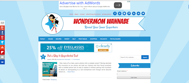
Wondermom Wannabe: Blog Review


Last weeks chosen blog from the Bloggers helping Bloggers: Blog Review Link Party was Wondermom Wannabe.  Congrats!

Wondermom Wannabe received eleven reviews from fellow bloggers, and countless compliments on her design and content but I have mainly included the criticisms to show what others feel needs improvement, and also this review would have been three times as long!

Header:


"I like the image, colour and size of the header"

"The title of your blog is very easy to read and see. My first impression is that the cartoon logo is a little immature, but at the same time I understand the logo and see that it matches your title."


"I love the picture of the superhero mom holding the baby."

"Not too big; creative and I love the social buttons right up top!"


Sidebar:


"I think you should have an image and short about me blurb above the search box. And I would like to see some breaks between the advertisements - with popular posts or something more personal, also I think your advertisements should all be similar sizes. The last three ads on the sidebar could probably be side by side."

"It's really clean! You have lots of ads on the side. For me it took a few minutes to load the page...maybe due to ads?"

"Not much actual content here.  I can appreciate the need for ads, and it's good that the subscription box is front and center.  However, I would really love to see an actual photograph of this mom.  She might be want to be a Wondermom, but it's hard to truly relate to a cartoon."

"First, I would love to see a picture of you and some blurb about you. I don't have anywhere to go to see more about who you are, and I want to. I think it would be helpful to add titles in your sidebar. Although there are a few items in the sidebar, I don't understand why they are there. Are they sponsors or rewards of some kind? I think your sidebar could offer more by adding some additional information such as categories, most read posts, etc."

Social Media:


"I can find your social media buttons, and they all lead to the correct pages. And I can definitely see where to subscribe- super important, and I think this is well done!"

"Your social media icons are front and center which makes it easy to follow. I might like to see a Pinterest widget, but that might be my personal opinion as I am a Pinterest addict." 

"I found it very easy to pin one of the articles that interested me onto my Pinterest board, using the social media buttons on the left side."

Content:


"I like all your content, and all the categories in your menu bar. I thought your "about" was too text heavy and needs more line breaks, and also an image of yourself. I find some of your post seem to be short in length, and I would like to see more images for posts like Keeping an Organized Home in which I loved that command center."

"You cover a lot of topics- I was drawn to the family meeting planner and I loved your content. You had great ideas about coming together to sort out schedules for the week and I love that you have each member chooses a meal. I find the content informative and well written."

"I would also suggest decreasing the number of posts on the front/main page that way they have to go to "previous" pages and that helps with the ads... but to compensate for less content on the first page, add a "favorite post or most popular post or read more" post on the side bar to get readers to see more content. "

"... I think the content is varied. There's not all of just one topic covered here. So it's appealing to lots of people!"

"I scrolled through the list of latest posts.  I found the thumbnails and titles to be "grabby."  In other words, they catch my attention and make me curious to read more.  (And I will.)"

"I also checked out a few of the recipes.  They were nicely illustrated.  Good instructions and descriptions without being too wordy.  Nice printable recap at the bottom.  And another great idea:  links for searching similar recipes."


"I like how informative her writing style is.  She adds her own flair and a bit of her own life into her blog posts but without sacrificing content on the post. (I have been known to give up reading a post because it took too long to get past whatever story about the blogger’s kids that was totally unrelated - or even related but just too long - before the actual meat of the post.)"

"When I took a look at the content, it seems formatted for bloggers, not the average mom, which could be her market.  I don't know.

I started by reading her first three blog posts that were not link-ups.  The first was on "Mid-Century Modern Homes," which, being a new-comer to her blog, confused me.  I thought this blog was about motherhood.  No mention of it here.

The next post was a muffin recipe with product placement.Obvious product placement.  Not such a big deal.  I mean, the recipe looked really good, and this post had my favorite pictures.  I assume one of the ladies was the wondermom, but I don't know which one. Anyway, based on this post, I started to get the idea that what she meant by "Wondermom" was "Super-fit mom."

That's not what I was thinking by the header.  This is where a really good "About Me" widget at the top of the sidebar would come in handy.  Who are you?  What is this blog about?  It's pretty, but I am confused after two posts.

So, I look at the third one.  About infused water.  Cute little post.  Still along the lines of fit mom.  Then, I go to the family category.  Lots of posts about exercise.  Yep.  Fit mom.  Not a bad thing.  It just clears up who I am reading about.  I am not super into fit moms, so I probably would not subscribe.

The thing is, if I was into fit moms, I wouldn't necessarily see it from the beginning.  I have to look around to find that.  She is probably losing potential subscribers.  Still, the personal posts are few and far between.  Is your content just sales posts?  That's cool and all, but I read blog to get to know the people who write them.  I want to know about their lives.  I want them to be my internet friends.  You don't seem to want to be friends with me.  I feel like you just want to sell me stuff. It's the complete opposite of your cool, friendly branding."


Readability


"I find your main font clear and large enough to read easily, and I also like the headline font and colour."

"Your font and size are very easy to read, especially against the white background. Your headings are also easy to spot and read."

Navigation


"Couple things I think could be helpful. First, if I am loving a post that I'm reading, I have to go back to your homepage in order to go to the next post. There isn't a way for me to go from one post to the next (at least, I don't see one). Also,I clicked on the "return to top of page" button at the very end of your post, and it didn't do anything. I was not taken to the top of the page."

"Easy to navigate with the search bar first, and clear categories."

"I really like the "Filed under" reference on each post that identifies its page.  That is a great idea, and I would like to figure out how to incorporate that into my blog."

"How easy it is to navigate, and find what you are looking for- It looks well-organized, but I am not sure how well thought out it is. As I mentioned, I can't tell from the beginning what this blog is about.  I could tell she was into health/fitness, but the headers for health and fitness are buried in the category titled "Self."  Not sure too many ladies are heading to the "self" category.  We should be, but we don't. We go to a blog about a mom to look for mom stuff.  This is probably why her first category is family, but in family, I see she's a fit mom. Vicious circle."


"The menu is easy to navigate. I would suggest moving the About and Contact section to the
main menu as these are important sections. People want to know more
about who is writing the blog. "


Overall Appearance


"I like the overall appearance, the colour choices are a good fit. Think the sidebar might be a bit wide and also ad heavy as I mentioned. Like your footer it's clean and concise."


"Your homepage has a wonderful layout! I love that each title is easy to see, and has a small picture and blurb to go with it!"

"I think her "above the fold" impression is amazing! It is very powerful! Love that first impression.  She has tons of ads, but she has managed to make it look clean and not cluttered. I would suggest adding an "about me" on the page. It's nice to see who is writing. It's a good visual."

"Really pretty! It reminds me of a superhero because of the bright, bold colors!"

"Overall very clean and organized. Good placement of ads, social media, and categories. The one thing that I would suggest is bringing more YOU to the table- there is no picture of you on your sidebar, or in your about section. There is also no tab about your life. I understand the importance of privacy, but I found myself looking for posts just about your day-to day. I had to click over to your instagram just to see the woman behind the blog. Please show more of your beautiful self!"

Comments and Suggestions:


 "I don't know what else to recommend. The site seems so clean and informative, I'm jealous. If anything, maybe remove an ad or two as there are two banners near the top and several in the sidebar."


"Here's what I recommend.  Put a gorgeous picture of yourself up, and write a little note about who you are and what your blog is about in the side bar.  Then, write more about you.  After you get some more personal content, re-categorize and sprinkle the sales stuff in those categories. Your stuff is scattered because it is not you.  I don't want to read this blog after exploring it.  Too sale-sy and not enough personal content.  The branding is beautiful and spot on, but I would rather subscribe to a blog that wasn't as pretty, but had sincere content.  If that's not your thing.  I get it.  Some folks want to keep their distance.  I am just not sure that you will have a community and a true following this way."
 
"All in all I love this blog site and am glad it was chosen for review for selfish reasons.  I now have another site I like a lot to follow.  :)"

Summary:

The reviews were mainly positive but I think everyone suggested they want it to be more personal with personal pictures and an about me. Everyone loved the header and found it very easy to read, and there were different suggestions for improving the organization and arrangement.

If you wanted a free blog review of your own blog by numerous fellow bloggers don`t forget to link up to Bloggers helping Bloggers every Tuesdays at 7:30 am EST.


Monday, June 8, 2015

Bloggers Helping Bloggers #2

So I was a little nervous posting Bloggers Helping Bloggers last week for the first time -- it's a bit of a new idea and wasn't sure how it would be received.

But everyone seemed so positive! We received 26 link ups and ten reviews, not to mention 450 views, 25 comments and +27 on Google+

That I am glad to continue the idea for bloggers to come together and review each other sites! This would be free - it just might take 10 or 15 minutes of your time but, you will have your site reviewed in return.

I have seen a few websites offering reviews but the costs ranged from $50 to astronomical prices, so I thought we could all help each other out.


I was trying to think of the best way to organize it, and am still thinking it over -- please leave a comment or e-mail me if you have any suggestions.

I was trying to think of a fair way to choose which site gets reviewed each week and decided to choose the blog based on a points system:

1. You will be given 5 points for linking up each week.

2. You will be rewarded 15 points for reviewing the blog of the week. (People who don't put in any effort will receive less points)

3. And a bonus 3 points for sharing on each different social media platforms every week. Please tag me so I can reward the points. Tag me @101thingstodo1, and +1 or share and comment on G+, share and comment on facebook or leave a comment on Pinterest. A tie will be given to the first one in the link up.

So for example if someone links up, reviews the weeks blog and shares on Google+ and Pinterest they will receive - 5 + 15 + 3 + 3 =26 points for the week which will be added to last weeks points.

Let me know if you have any questions???

And if everyone wanted I can post the current points (excluding the e-mail addresses) so you know when your blog will be reviewed. please leave a comment

One site will be chosen each week, and the review will be posted on my site Monday's beginning at 7:30 am EST. Because the review is so long I will be switching the link-up to Tuesdays at 7:30 am and the review will be posted Mondays at 7:30 am. starting next week. (Sorry for any confusion)

You can read last week`s Blog Review: Musings of an Average Mom here. You might gain some helpful tips that you can apply to your own blog.  

http://musingsofanaveragemom.blogspot.ca/2015/06/musings-of-average-mom-blog-review.html


Please review sites on:

- header
- sidebar (appearance and arrangement)
- how easy it is to follow on social media
- content
- how easy it is to read (fonts, etc.)
- how easy it is to navigate, and find what you are looking for.
- overall appearance
- other comments or suggestions
 
And the winner this week is... Wondermom Wannabe with 26 points for promoting on Google+ and Twitter!


http://wondermomwannabe.com/


Please e-mail your review to kristenstevens@live.ca and I will review and organize/summarize them and post them next week. Along with the next blog to review. 

And although it's not necessary I would love it if you followed me (I always follow back):

You can follow me on Pinterest, Google+, Facebook or Twitter 

And I would really appreciate it, if you could share this party on your sidebar or link party page. It will be better to get more reviews and opinions on your blogs.

Musings of an Average Mom

Please bare with me as  I will try to iron out any kinks as we go along...

Please link up your main blog - and make sure you're email is correct as I will use this to contact the winner. And I will try to get to everyone in a fair and timely manner.

And please don't forget to review the blog of the week (this week is Wondermom Wannabe) And bonus points are rewarded for promoting on social media. tag me on twitter @101thingstodo1,


Disclaimer: Musings of an Average Mom will use screenshots of your blog if you are chosen as the blog to be reviewed. And your comments will be copied and posted anonymously in the blog review.

Monday, June 1, 2015

Bloggers Helping Bloggers

So I had this idea for a while - for bloggers to come together and review each other sites! This would be free - it just might take 10 or 15 minutes of your time but, you will have your site reviewed in return.

I have seen a few websites offering reviews but the costs ranged from $50 to astronomical prices, so I thought we could all help each other out.


I was trying to think of the best way to organize it, and am still thinking it over -- please leave a comment or e-mail me if you have any suggestions.

I was trying to think of a fair way to choose which site gets reviewed each week and decided to choose the blog based on a points system:

You will be given 5 points for linking up, and 15 points for reviewing the blog of the week. (People who don't put in any effort will receive less points) And a bonus 3 points for sharing on social media. Please tag me so I can reward the points. A tie will be given to the first one in the link up.

Let me know if you have any questions???

One site will be chosen each week, and the review will be posted on my site Monday's beginning at 7:30 am EST.

Please review sites on:
- overall appearance
- header
- sidebar (appearance and arrangement)
- how easy it is to follow on social media
- content
- how easy it is to read (fonts, etc.)
- how easy it is to navigate, and find what you are looking for.
- other comments or suggestions

And since this was the first week, and I hadn't chosen a blog to review yet, I though we could begin with my own... (shameless I know....)


Please e-mail your review to kristenstevens@live.ca and I will review and organize them and post them next week. Along with the next blog to review.

And although it's not necessary I would love it if you followed me (I always follow back):

You can follow me on Pinterest, Google+, Facebook or Twitter 

And I would really appreciate it, if you could share this party on your sidebar or link party page. It will be better to get more reviews and opinions on your blogs.

Musings of an Average Mom

Please bare with me as this is the first week and I will try to iron out any kinks as we go along...

Please link up your main blog - and make sure you're email is correct as I will use this to contact the winner. And I will try to get to everyone in a fair and timely manner.

And please don't forget to review the blog of the week (this week is mine)

And you may leave a comment if there is anything you wanted people to focus on in their review and I will try to include it when your blog is chosen.

Thanks so much for participating!!!


Sorry this link party is closed visit Bloggers Helping Bloggers #2 for the current link party.


Related Posts Plugin for WordPress, Blogger...